Designing BeeReader for the Apple Watch
How we shrank a comfortable reading experience down to a 45mm screen without losing the calm — the constraints, the type choices, and the tricks that made it feel effortless.
Created by Bee
Updated 2 July 2026
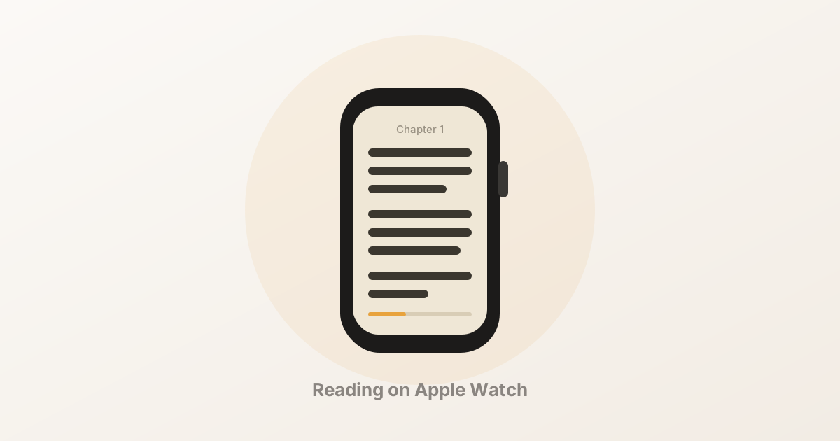
Reading on your wrist sounds absurd until you try it. BeeReader started as an experiment — could a long article ever feel pleasant on a screen the size of a postage stamp? A year later, it’s the app we reach for most. Here’s how we got there.
Start from the words, not the frame
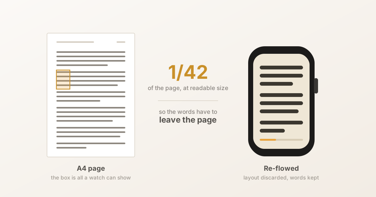
Most Watch apps begin with the hardware: the crown, the haptics, the small canvas. We flipped it. We began with a single paragraph of real prose and asked what it needed to breathe — line length, leading, contrast — then built the smallest interface that could hold it.
That reframing changed everything. The screen stopped being a limitation and became a viewport that you scroll through, one comfortable column at a time.
Typography does the heavy lifting
On a small display, type is the design. A few decisions carried most of the weight:
- Generous line height. Cramped leading is the fastest way to make text feel like work. We opened it up until each line had room to land.
- A short measure. Roughly 30–34 characters per line keeps your eye from getting lost between one line and the next.
- Warm paper, soft ink. Pure white on pure black is harsh at arm’s length. Our cream-and-ink palette is easier on the eye in a dim room.
Let the crown do what it’s good at
The Digital Crown is the one input that feels genuinely native to the Watch. BeeReader maps it to a single job — smooth, momentum-free scrolling — so you can nudge a paragraph into view with a fingertip and never touch the glass.
Sync that stays out of the way
Your place is saved continuously and mirrored to your iPhone, so picking up a piece on the couch after starting it on a walk just works. No buttons, no “resume?” prompts — the app simply remembers.
What we left out
The hardest work was subtraction. No inline images. No comments. No settings maze. Every feature we cut made the remaining ones clearer. On a screen this small, restraint isn’t a compromise — it’s the whole point.
If you’ve been curious whether reading on the Watch can be more than a novelty, that’s exactly the question we set out to answer. We think the wrist is a wonderful, quiet place to read.